Blue or red might be a favorite color, but before choosing a paint color for a particular room, think about how color influences mood. For example, while a color like red may have just the energizing effect you’d like in a dining room or family room, it may be too stimulating for a bedroom. Read through these colorful attributes and learn how create an intended mood or atmosphere through color choices.
Purple Promotes Peace
Purple is a combination of red and blue and while it lends excitement, it looks regal and rich and is especially crisp with white. Tones of purple lend an undercurrent of energy without over stimulation.
Green Brings Balance
Green has a positive influence that promotes confidence and relaxation and it is the symbolic color of life and spring. It is a combination of yellow and blue and is perfect for promoting relaxation and rest.
Cool Calming Blue
Blue is the coolest of colors on the spectrum and it calms the nervous system. This makes it a great choice for a bedroom, kitchen or family room, but it is a bit too laid back for a home office, where it can encourage you to nap when you should be working.
The High Energy of Orange
Orange is a combination of yellow and red and is a warm, lively hue that can be used wherever you want to promote positive energy. Use it in a kitchen, home office or sunroom as an inviting contrast to neutral tones.
Sunny Yellow
Invite a cheerful mood into a room with a sunny yellow tone. Creamy buttery shades of pale yellow create an easy to live with pastel backdrop, while bold yellow is a striking splash of color that can be good choice for accents in kitchens, family rooms, laundry rooms and sun rooms.
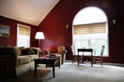
Passionate Red
Red is a passionate stimulating color that can bring excitement to a kitchen and richness to a dining room, especially when combined with gold and the sparkle of mirrors. Tone it down with neutrals, or slip toward deeper burgundy, and you will tone down the energizing brightness while keeping the richness of tone.
Invite Mystery with Black
The dark mystery of black has a grounding force in a room and it balances other colors. Use it in accents to balance bright colors and contrast it with neutrals or brown for a sophisticated contemporary palette. Black does absorb light, so additional light may be needed in a room when black is used in more than small doses.
White is Uplifting
White symbolizes purity and is the absence of all colors. It makes a room feel spacious and combining shades of white will bring a sophisticated airiness to a space. Warm up a white space with brightly colored accents that will jump to the foreground against this neutral backdrop.
Neutral Tone
Neutral shades of beige, such as sand, khaki or taupe, let you accessorize with any other colors because they work with both warm and cool hues, so it is a great choice if you like to change furnishings and accessories from time to time. It will complement boldly colored furniture or accessories, letting them take center stage, or it will blend with neutral furniture and accessories, creating a harmonious mood.
Sophisticated Gray
Gray combines black with white and adds a stately air to a room that will provide a pleasing backdrop to warm or cool colors, or a modern crisp palette of black and white. Trim it out with white wood work for a crisp sophisticated frame that will let you take your decorative choices in any direction.